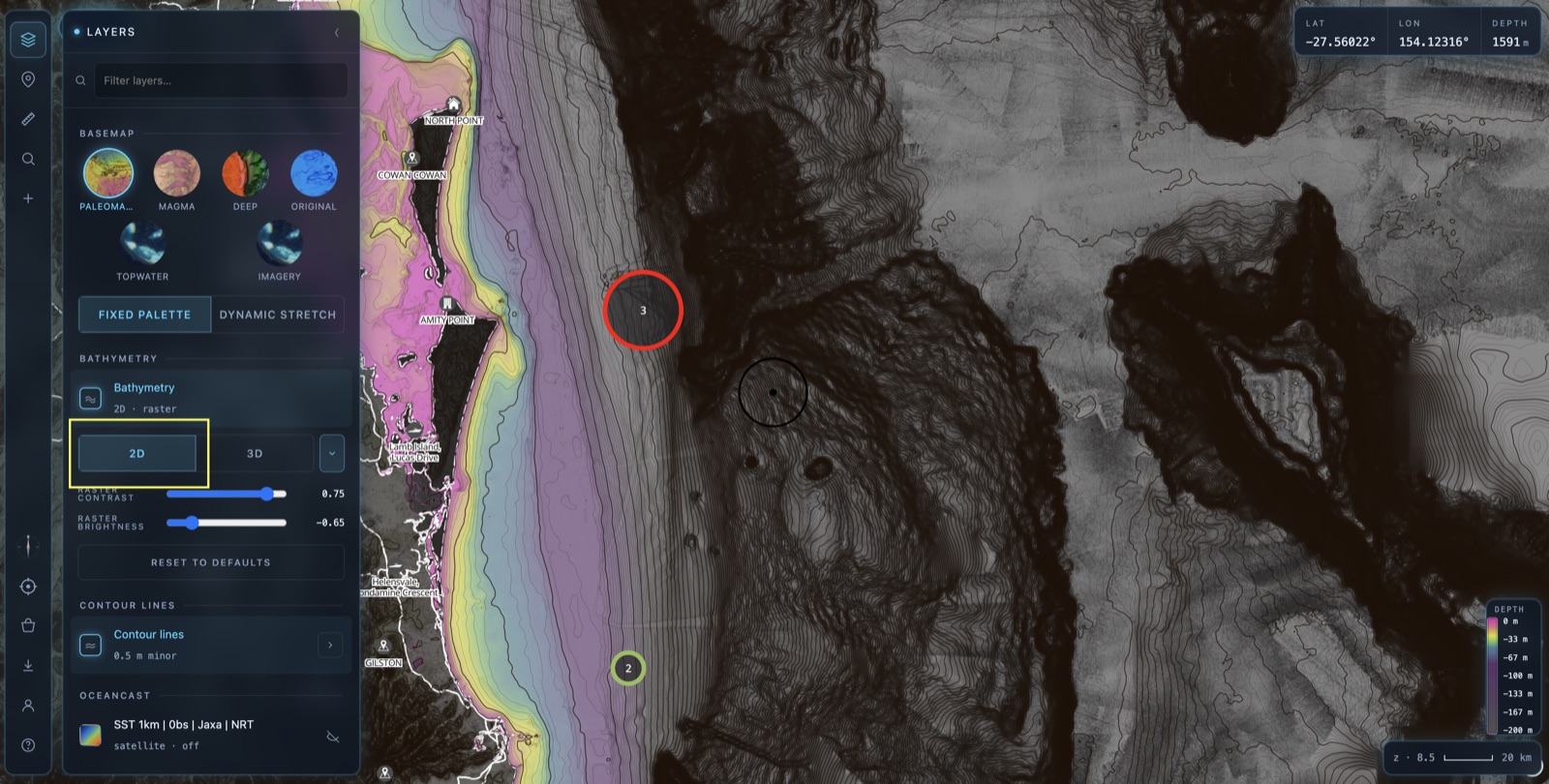
Drop to 2D first
Open the Layers panel from the stacked-layers icon in the top-left toolbar, scroll to the BATHYMETRY card and make sure it's set to 2D.
OceanCast layers are big, live datasets. Stacked on the flat 2D chart they run smooth and fast. You can run them over 3D terrain on a powerful device, but combining oceanography with 3D is the heaviest thing you can ask the map to do — so for OceanCast, 2D is the sweet spot.
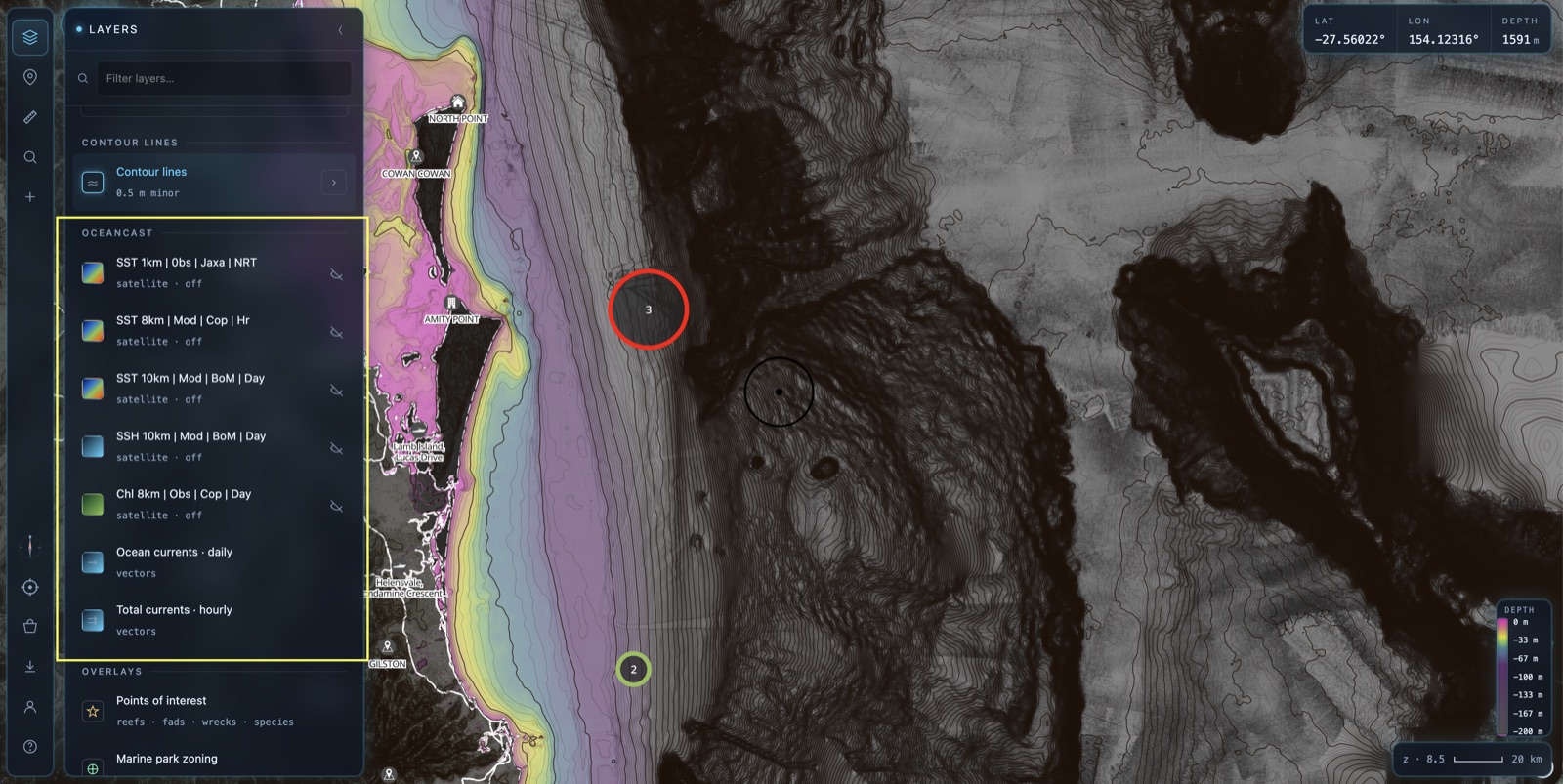
Turn on an OceanCast layer
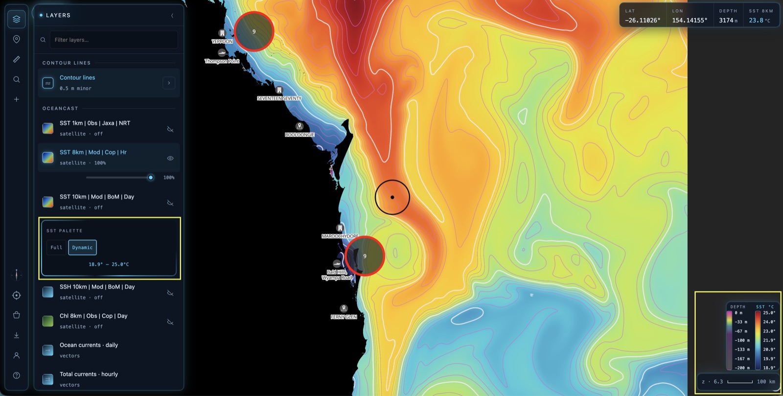
Scroll down to the OCEANCAST section. Tap any layer to switch it on — in the example we've turned on SST 8km. Each layer carries a short code so you know exactly what you're looking at: resolution, whether it's Observed (satellite) or Modelled, the source, and how often it updates.
💡 A nice side-effect
With any OceanCast layer on, the map lets you zoom further out (to a region-wide view) so you can read the whole current system, then zoom back in to work an edge. Turn the layers off and the map snaps back to its usual close-in detail range.
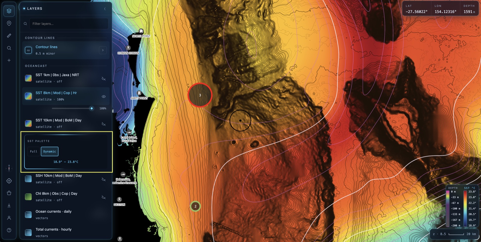
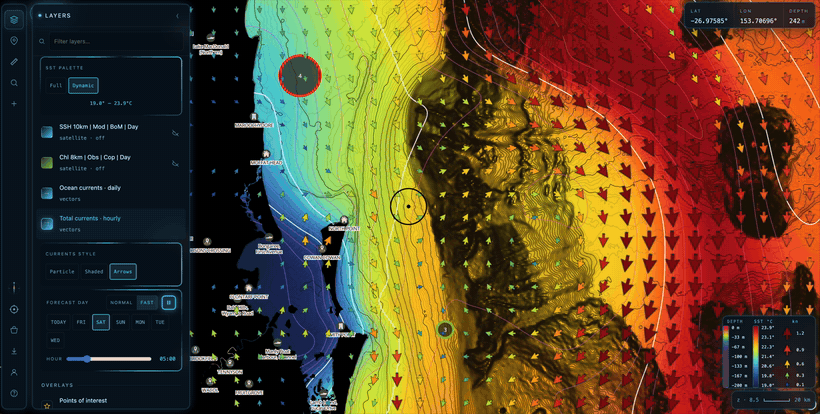
SST palette: Full vs Dynamic
With an SST layer on, an SST PALETTE toggle appears underneath it. It controls how temperatures are coloured — and it's the difference between reading absolute temps and reading edges.
Full maps the whole colour palette across its entire designed temperature span. A colour means the same temperature everywhere, every day — our palette is tuned for the AU east-coast pelagic bite breaks (the bands at 22 / 24 / 26°C), so Full is how you spot an absolute target temperature.
Dynamic takes that same palette and stretches it to fit only the temperatures currently on screen. The min→max readout under the toggle (e.g. 18.9° – 23.8°C) tells you the current stretch. Because the full colour range is squeezed into a narrow band, the faintest half-degree edge suddenly pops.
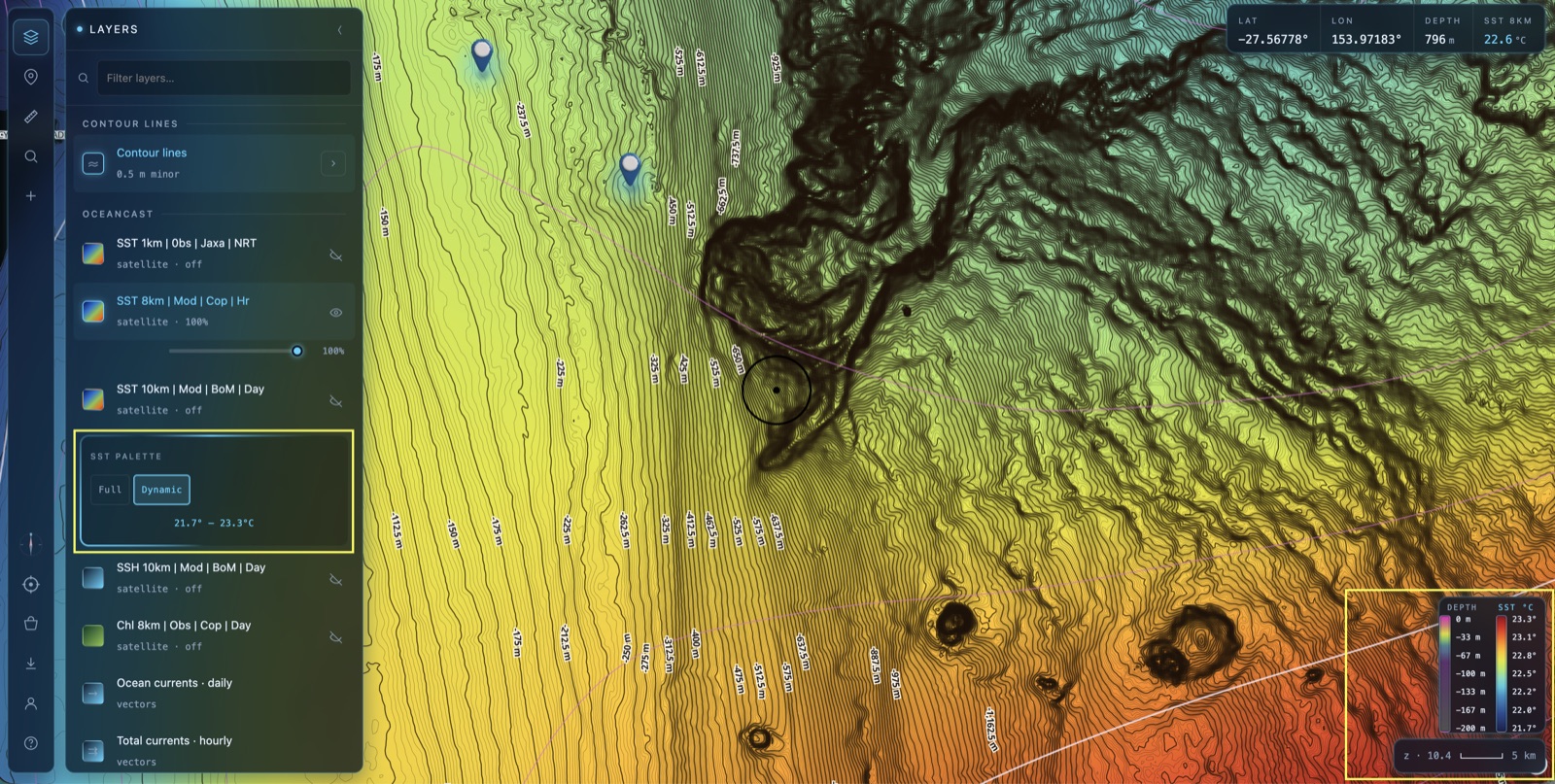
Watch Dynamic stretch as you zoom
Dynamic re-stretches every time you pan or zoom, always fitting the palette to whatever's in view. This is where it earns its keep.
Zoomed in (left, ~z10) only a narrow patch of ocean is visible, so the temperature range is tight — here about 21.7° – 23.3°C. The whole palette spreads across that sliver, exaggerating every subtle break and tendril of warmer water.
Zoomed out (right, ~z6) the view covers the whole region, the range widens to roughly 18.9° – 25.0°C, and the palette spreads across the big picture — cool inshore water, warm current offshore, and the front in between.
Add a currents layer
Temperature tells you where the edge is; currents tell you which way the water's pushing. Switch on Total currents (hourly) or Ocean currents (daily) and a CURRENTS STYLE control appears with three ways to draw the flow. Pick whichever reads best for what you're doing.
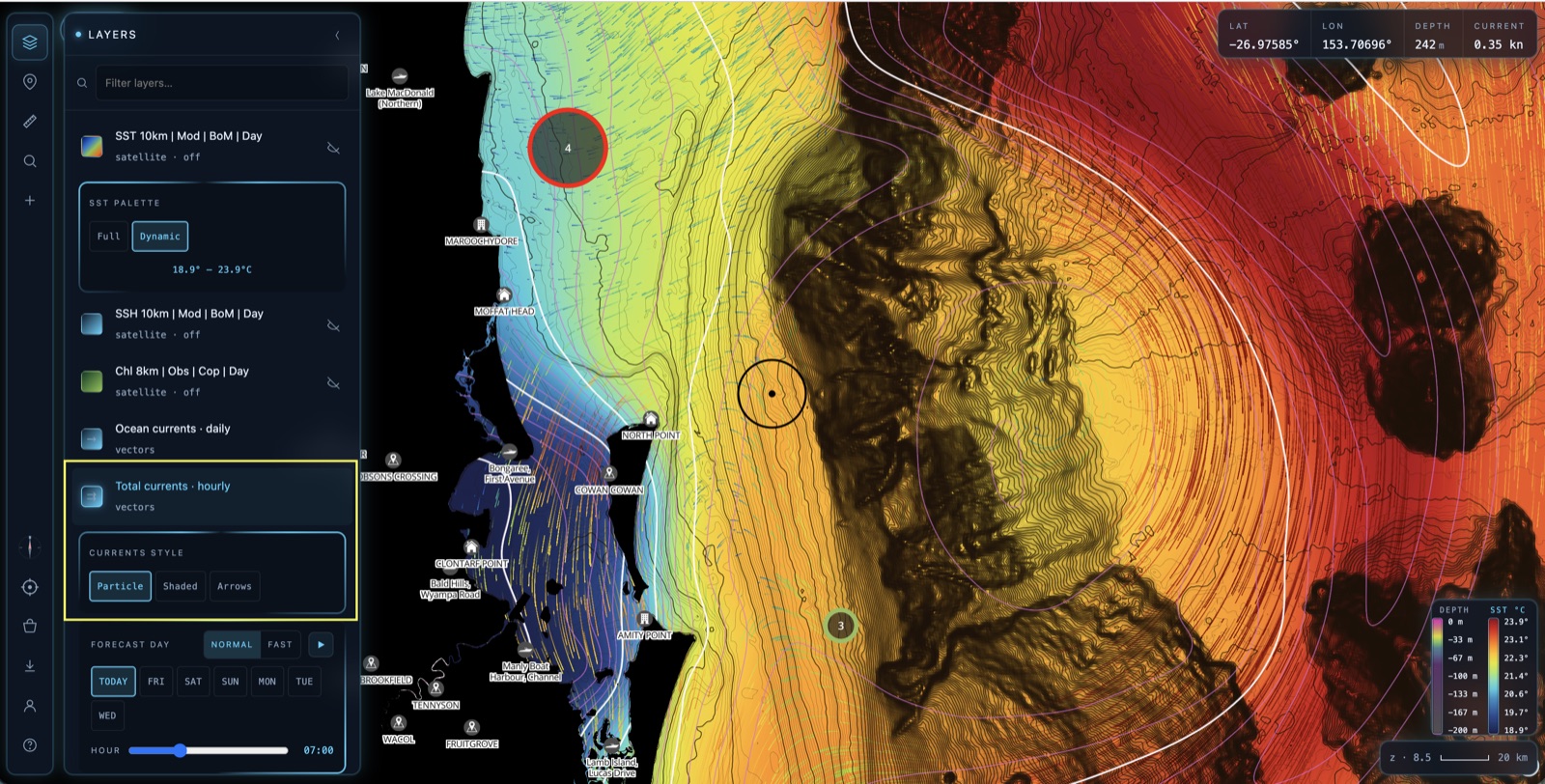
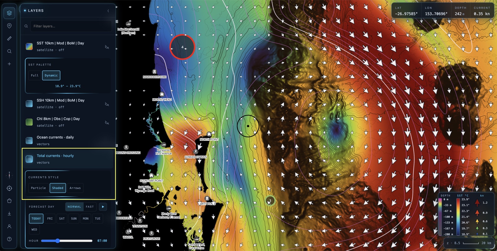
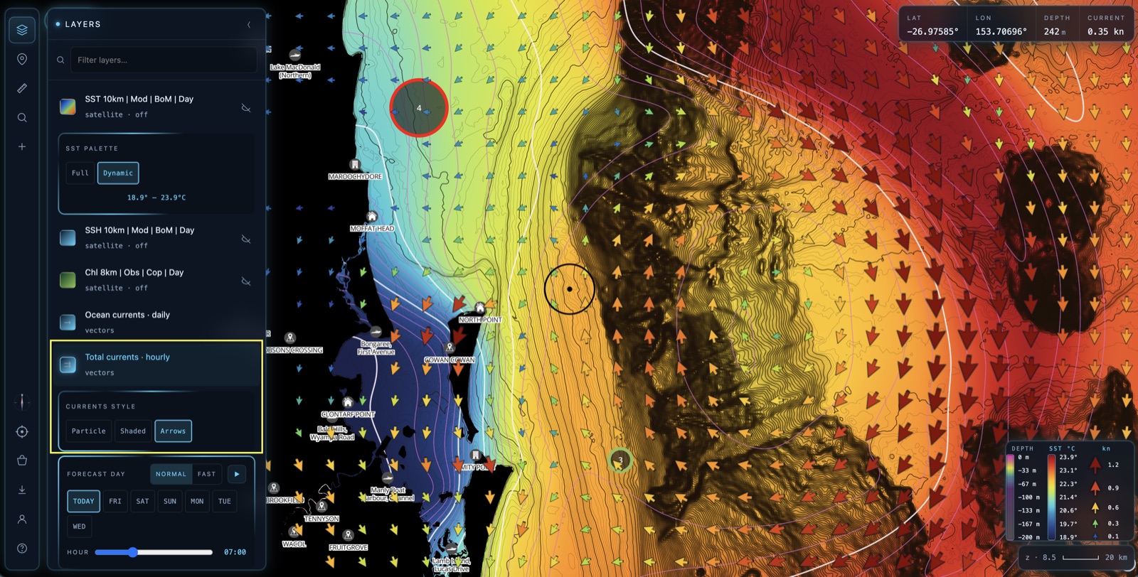
The three current styles
The styles aren't just cosmetic — the real choice is what happens to the SST underneath. Two of them overlay the current on top of your temperature picture; one replaces it.
Particle (above) animates the flow — thousands of particles drift along the current so you can feel the direction and pace at a glance. It's drawn purely over the top, so your SST colour stays fully visible — you read temperature and flow together.
Shaded lays down its own colour raster: current speed as a heatmap (cool blue = slow, hot red = fast) with white arrows over the top for direction. Because it paints the whole area, that raster sits over the SST and hides it while it's on — the colours you're now reading mean current speed, not temperature. Reach for it when finding the fastest push matters more than the temperature edge.
Arrows has no raster at all — just a clean grid of arrows, each tinted by speed and pointing the way the water's moving. Like Particle, it overlays without hiding the SST, so you keep the full temperature picture and add direction + speed on top. The arrow density rebuilds as you zoom, so the field stays readable at every scale.
👁️ At a glance — what you see underneath
- Particle — SST stays visible. Temperature + animated flow.
- Shaded — SST hidden. Colours now show current speed.
- Arrows — SST stays visible. Temperature + speed-tinted arrows.
Play the forecast
OceanCast doesn't just show now. The hourly layers — SST 8km and Total currents — carry a forecast, and the FORECAST DAY strip at the bottom of the panel lets you play it.
Pick a day, then hit play. The map steps through the forecast day-by-day and hour-by-hour, so you can watch the temperature fronts shift and the current push build and ease over the coming week. Toggle NORMAL / FAST to change the playback speed, or scrub the HOUR slider by hand.
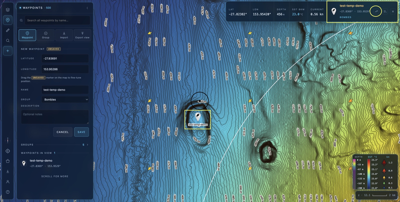
Forecast graph at any waypoint
Want the numbers for one exact spot rather than the whole map? Tap a waypoint to select it, then tap the graph icon in the top info dash. OceanCast pulls the forecast for that precise location and plots it on a chart.
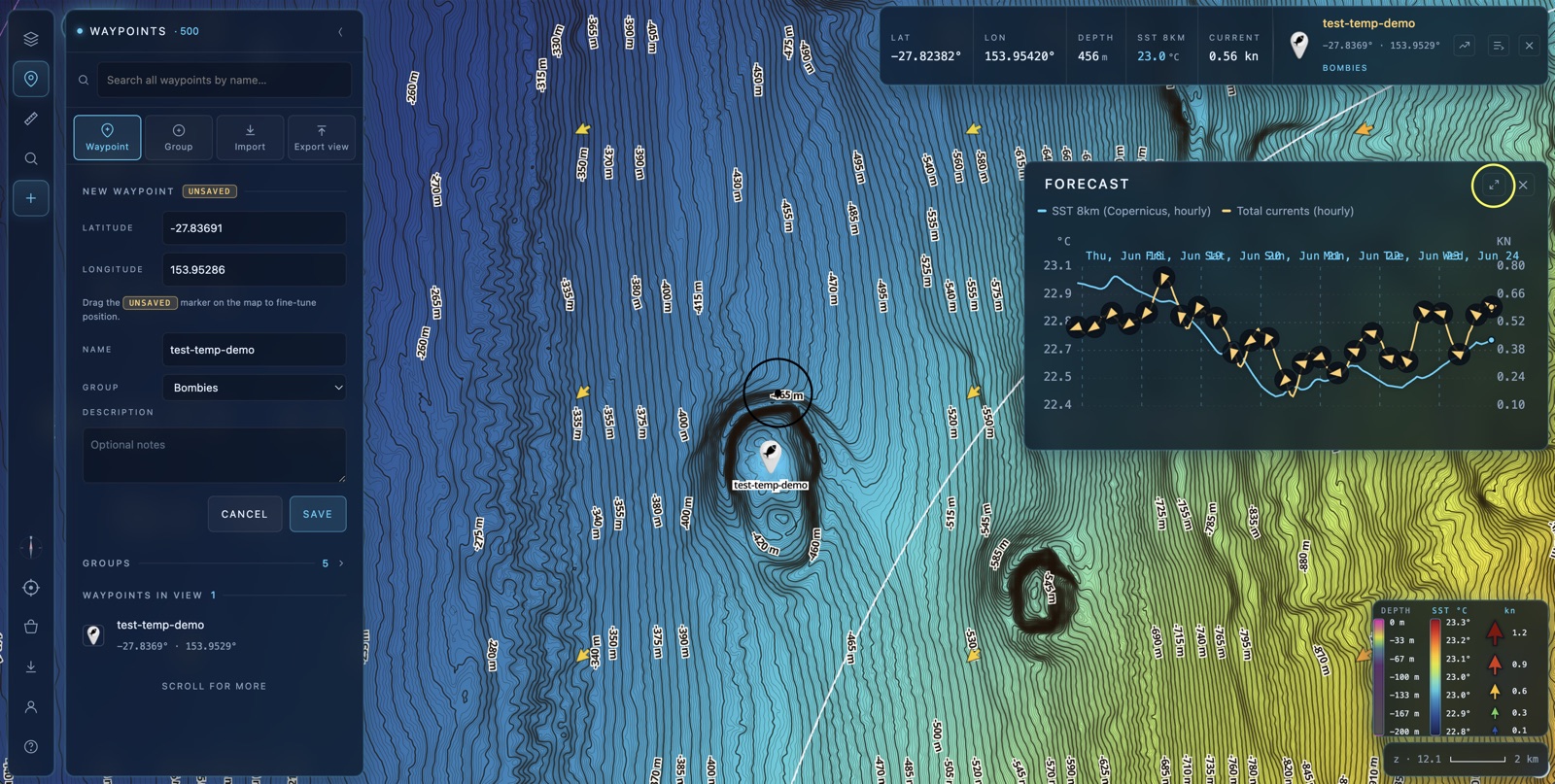
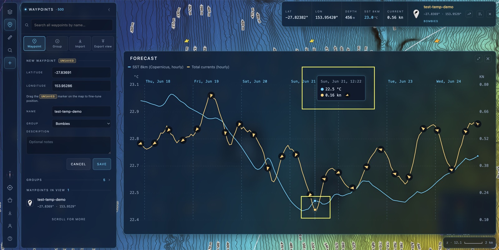
The Forecast chart plots the days ahead with a dual scale — temperature (°C) on the left, current speed (kn) on the right — so SST and current strength sit on the one timeline. Tap the expand icon in its corner to maximise it.
Maximised, the chart fills the screen and a tooltip widget follows your cursor: hover or scrub across the timeline to read the exact SST and current speed at any hour of the forecast. It's the fastest way to answer “what will it be doing here on Sunday morning?”
🎣 How the layers work together
- SST finds the edge — switch to Dynamic to make subtle breaks jump out.
- Currents show which way the water pushes the bait along that edge.
- SSH & Chlorophyll add the structure and the colour line that hold it all together.
- Forecast tells you when it'll line up — on the map, or at one exact mark.
That's OceanCast. 🌊
Flick on a layer, find an edge and plan your next session around the moving water.
Open BathyMaps →